
Why Most Design Systems Fail
A design system is more than just a Figma file or a library of React components. It is the shared language between designers and developers. However, most systems fall apart because they prioritize artifacts over adoption.
True scalability comes when your design system treats code as the source of truth, not a downstream deliverable. At Domain Expansion, we use a "Code-First" approach that drastically reduces the drift between design intent and production reality.
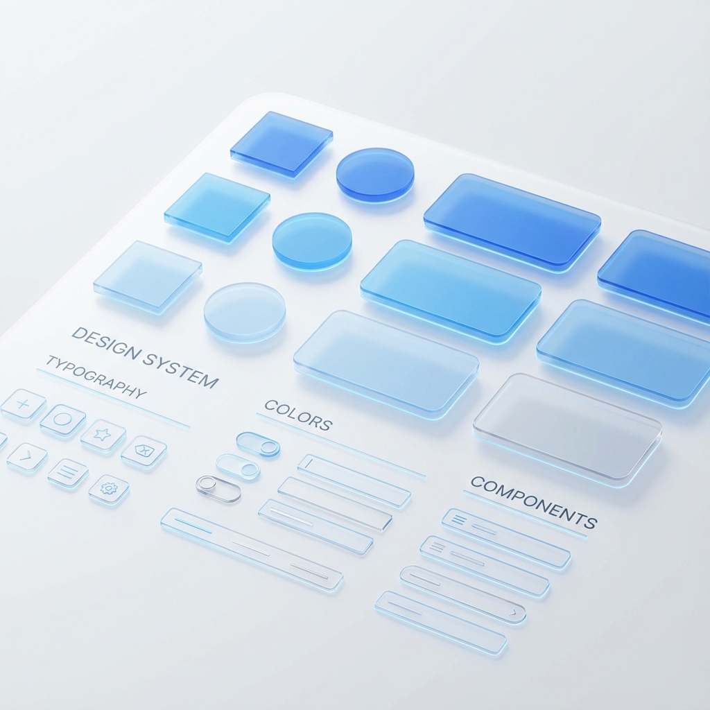
Core Principles of a Scalable System
- Atomic Design: Breaking down UIs into atoms, molecules, and organisms to maximize reusability.
- Tokenization: Using design tokens (variables) for colors, spacing, and typography to enable seamless theming (like Dark Mode) without code changes.
- Strict vs. Loose Typing: Leveraging TypeScript to enforce usage patterns while allowing enough flexibility for innovation.
Infographic: The Token Pipeline
Component Architecture in React
We structure our component API surfaces to be "Composable by Default." avoiding the "Prop Drilling" hell that plagues many legacy codebases.
The "Commpon" Pattern
Instead of a massive configuration object, use sub-components:
// Avoid this:
<Card title="Hello" content="World" footerButtonAction={...} />

// Do this:
<Card>
  <Card.Header>Hello</Card.Header>
  <Card.Body>World</Card.Body>
  <Card.Footer>
    <Button>Action</Button>
  </Card.Footer>
</Card>
Documentation as a Product
Your design system is a product, and your developers are its customers. We use tools like Storybook not just for development, but as living documentation that allows non-technical stakeholders to "play" with the UI pieces.
Measuring Success
How do you know if it's working? We track:
- Detach Rate: How often are designers detaching instances in Figma?
- Adoption Rate: What percentage of the codebase imports from
@system/ui? - Velocity: Time-to-ship for standard UI features (Login, Settings, etc.).